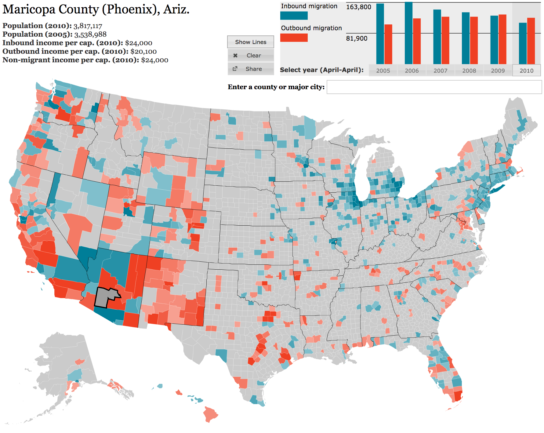
My interactive migration map for Forbes, showing inbound (blue) and outbound (red) migration to and from Maricopa County, Arizona
My latest interactive migration map on Forbes.com improves on the previous version in a few ways: it’s got five years of data instead of one; a brand-new layout; and some much-requested features like a search tool and the ability to switch off the lines. But the upgrade that I’m most excited about is in the code: I built the map using nothing but open-source software, from Python and MySQL to handle the data right down to JavaScript to display the map. I’ve been steadily moving much of my data handling to Python and MySQL, but this is the first map I’ve made using JavaScript, and interactive JS maps are still rare elsewhere, too.
The previous map was built in Flash, and I used some other proprietary software to handle the data and tweak the presentation. Moving to JavaScript for interactive applications saves money you’d otherwise spend on Flash licenses and it makes your work more widely available: this map functions on the iPad, for instance (albeit very slowly, since it’s computationally intensive and involves fairly large downloads). Here, in case it’s useful for anyone else who makes these sorts of things, is a rundown of how I built the map.
Overview
This year’s map is similar in basic function to last year’s. When you visit the page, JavaScript code renders a county map of the United States and prepares it for interaction. When you roll over a county, an event listener fires, displaying a callout with the name of the county and turning the county’s edges red. When you click on a county, your browser downloads a corresponding file that includes a list of other counties to which and from which people migrated, along with relevant stats (income per capita of migrants) and the figures that are shown above the map (year-by-year migration, population). Your browser fills out the stats at the top of the screen, draws a graph (or animates a change from the previous graph, if you’ve already clicked on a county), and loops over the counties in the file, filling them with some shade of red or blue to indicate net inward or outward migration.
My JavaScript code deals with two big datasets: one—the migration data—is downloaded and rendered on the fly every time you click on a county. The other consists of the contours of the map itself: the locations of the boundaries that define the 3,143 counties in the United States.
The Map
I started by building a generalized interactive map of U.S. counties, where each county listens for rollover and click events and the appearance of each county can be changed programmatically. This is the sort of interaction that Flash has been critical for in the past, but the rise of faster browsers that better comply with universal standards means we can make this sort of map with JavaScript.
You can build a map like this with HTML5 Canvas, or, more promisingly, publish the map as an SVG image and use a library like JQuery to manipulate the appearance of the counties with CSS. But neither of those techniques is compatible with Internet Explorer 7 or 8, which together still have significant (roughly 15%, in the case of this map) market share. To get around this browser compatibility issue, I used the excellent Raphaël JavaScript library to draw counties and handle interactions with them. Raphael renders images as SVGs for users with modern browsers and as VMLs for Internet Explorer users, and it provides a useful set of functions for interacting with shapes once they’ve been drawn.
We want Raphael to create each county as a polygon (or group of polygons). For this, we need polygon definitions for each county, and we can find those in a very useful SVG file available on Wikimedia. SVGs are vector graphics that work something like HTML; open this SVG county map in a text editor and you’ll see a list of nodes that look like this:
<path
 d="M 404.13498,227.558 L 407.75898,227.324 L 407.95298,228.019
    L 408.99798,231.791 L 409.07498,232.061 L 405.21798,232.503
    L 404.57198,232.58 L 404.13498,227.558"
 id="01111"
 label="Randolph, AL" >;
That definition draws and labels Randolph County, Alabama. The “d” attribute contains the county’s edges: start at x = 404, y = 227, then move to 407, 227, and so forth. We need to get these paths into Raphael so that we can draw them on the page. Fortunately, the path definition syntax for Raphael looks very similar; we can convert the SVG’s paths to the slightly more compact Raphael format using regular expressions and scale linearly as needed to the width and height of our eventual map.
I extracted the path definition and county ID (a FIPS code—see below) from the SVG file with Python’s useful BeautifulSoup library and stored them in a MySQL database . I then queried that database, along with another one that I’ve built to return properly-styled place names (i.e., “Randolph, AL” becomes “Randolph County (Roanoke), Ala.”), to create a single JSON file that contains a name, ID and path definition for each county. Here’s how Randolph County looks in that file (remember that I’ve increased the size of the map to fit my page, and have scaled the path linearly):
["01111", "Randolph County (Roanoke), Ala.",
    "M727,410L734,409L734,410L736,417L736,418L729,419L728,419L727,410"]
This JSON file is fairly large (mine is about 580KB), but it’s much smaller than the original SVG file (about 1.9MB). Now it becomes easy to download this definition file, loop over it, and draw the counties. In the map’s JavaScript, we write (after importing JQuery and Raphael):
$(document).ready(function() {
    $.getJSON("/path/to/counties.json", function(data) {
        drawMap(data);
    })});

function drawMap() {
    map = Raphael(
        document.getElementById("map_div_id", mapWidth, mapHeight)
    );

    var pathCount = data.length;
    //Loop over all of the counties in the JSON file
    for (i = 0; i < pathCount; i++) {
        //The county's polygon definition is available at data[i][2]
        var thisPath = map.path(data[i][2]);
        //and its ID is at data[i][0];
        thisPath.id = data[i][0];
        thisPath.name = data[i][1];
        //Give the paths whatever appearance you want
        thisPath.attr({stroke:"#FFFFFF", fill:"#CBCBCB",
            "stroke-width":"0.2"});
        //Add event listeners for rollovers
        thisPath.mouseover(function (e) {countyMouseOver(e)});
    }
}
Now the event functions will look something like this. You just have to retrieve the event target’s Raphael node, and then you’ve got yourself a Raphael object that can take all of the Raphael methods. Avoid the temptation to operate directly on these targets with JQuery, because then you’ll lose Internet Explorer compatibility.
function countyMouseOver(e) {
    //Retrieve the mouseover target as a Raphael object
    var raph = e.target.raphael;
    //Use this to display a callout or whatever
    var thisCountyName = raph.name;
    //Change the color of the county's edges to indicate selection
    raph.attr({stroke:"#FF0000", "stroke-width":"1"});
    //Get ready for a click
    thisPath.click(function (e) {countyClick(e)});
}
There’s obviously a lot more than that going on in the migration map, but that’s the foundational structure of the map. It takes a moment for most browsers to render this, but there’s still room to load all of your data in this step if you’re doing something fairly simple with your map. If you need to show more data, you’ll have to make the map download it on the fly, as I do in the migration map.
Adding More Data
The migration map presents a little under 20 megabytes of data in total—that’s pairwise in- and out-migration totals for every county in the country for five years. We obviously can’t have users download all of this data at the outset, and that’d be overkill in any case because most users only look at a handful of counties in a single session. So I pre-compiled one JSON file for each county for each year (15,715 files altogether) and published them to Forbes.com. The map downloads and parses them as users click on counties. So the countyClick function looks something like this, specifying an individual county JSON file to download and initiating the process:
function countyClick(e) {
    var thisID = e.target.raphael.id;
    //Compose the path to the JSON file for this county
    var url = 'path/to/json/files/' + thisID + '.json';
    $.getJSON(url, function(data) {renderData(data)});
}
Then we do whatever we want with the data in the callback function renderData(data).
The IRS Data
A bit about the IRS data I used in the migration map, in case you’re interested.
This data comes in two files for each year, one for inbound moves by county and the other for outbound moves. Each file contains one line for each pair of counties in the country along with tax return stats for the people who moved between them: number of returns, number of exemptions, and total adjusted gross income, in thousands, for those returns. So in the 2009 outbound CSV file, we see this line:
"01","001","01","047","AL","Dallas County",42,94,972
In dealing with these files it’s useful to know about FIPS codes, 5-digit unique identifiers for each county. The first two digits correspond to the state and the last three to the county. In the IRS files they’re broken apart. When concatenated, the two columns on the left give us the county code for Autauga County, Alabama (01001). The third and fourth columns give us the code for Dallas County, Alabama (01047), and the last three columns tell us that people who moved from Autauga County to Dallas County in 2009 filed a total of 42 income tax returns, on which they counted 94 exemptions, and that the total adjusted gross income on all of those returns was $972,000.
Note that only people who file income tax returns will be included in this data, so it leaves out some retirees, some young people, and some low-income people. Nevertheless, we can glean a lot of information from this single line of data that’s useful in comparing this migratory flow to other migratory flows around the country: for instance, that adjusted gross income per capita among people who pay income tax and moved from Autauga County to Dallas County in 2009 was $10,340. (Household AGI, if you want to make an additional leap to equate a tax return with a household, averaged $23,100.) The IRS only reports these figures for groups of 10 returns or more, in order to preserve the privacy of filers.
Since the IRS data comes in the form of two CSV files per year, it’s best to consolidate all of the data in one place—I uploaded it to a MySQL database that was easy to query when it came time to build the individual county files that underlie the map.