My old interactive migration map for Forbes, built with Flash. Read about the updated version here.
A few days ago, I published an interactive map of American migration on Forbes.com. Since then, it’s become more popular than I could have possibly imagined. It’s been shared 5,000 times on Facebook and written about by The Economist, three different Atlantic blogs, three different New York Times blogs, and basically the entire “-ist” franchise (Gothamist, Chicagoist, DCist, and so on)–plus 1,700 other blogs and publications of various sorts. It’s broken Forbes‘s record for interactive content. To say I’m grateful for the reception would be a profound understatement.
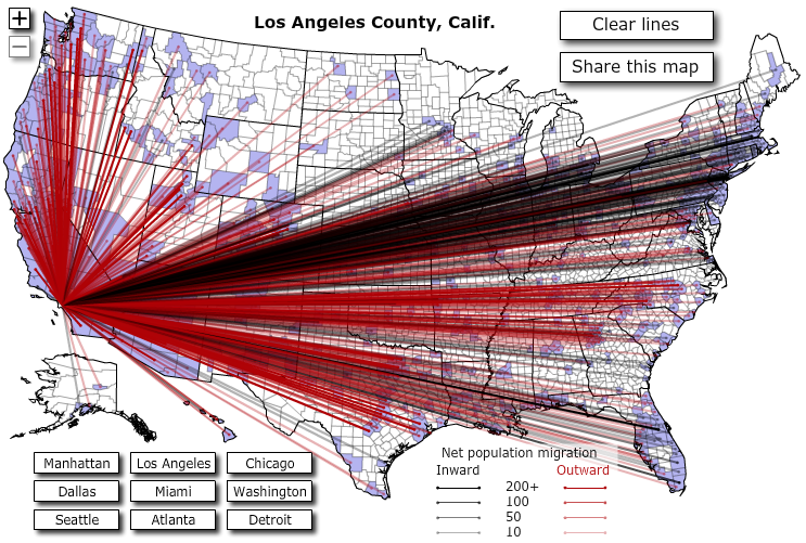
Part of the reason that readers have enjoyed the map, I think, is that it confirms graphically what people have long known or suspected about regional trends based on either hard statistics or gut feelings: that the Pacific Northwest is being flooded with Californians, that Florida is suffering from brain drain, that Los Angeles no longer has the universal draw that it had during much of the 20th century, and that Detroit is in serious trouble and Dallas is doing rather well for itself.
At a higher level, the map confirms that the United States is a highly mobile country: one in which the lack of jobs in Detroit and the surfeit of them in Dallas draws massive numbers of people (806 of them, in fact, moved to the Dallas region from Wayne County; 167 went the other way). Commentators have offered theories of how taxes, costs of living, and quality of life create patterns on this map as well. Americans know what they like, and they’ll move to get it.
In skimming through the astonishing number of comments that people have posted (mostly to sites other than Forbes.com), I’ve come across a few persistent questions that I’ll answer here before explaining how the map works.
The lines obscure everything! Why not just use colored fills in the counties (i.e., a choropleth map or heat map) to illustrate net change?
Because that would be visually boring. The lines create a narrative by forcing the reader to see relationships between counties, not just flat characteristics. Click on Miami: your eye immediately catches the big swoosh of people from the Northeast and then follows its outward counterpart to the West. The lines are dynamic and directional; they suggest movement, which is exactly what the map is meant to show.
The other problem with the heatmap approach is that it would result in lots of emptiness: Maricopa County, Ariz. (which contains Phoenix) has the most connections of any county: 834. That’s a lot of lines on this map, but it’s not many counties to color: just over a quarter of the 3,000 or so counties on the map. Rather than seeing an explosion of movement when you click on Maricopa County, you’d see a limp, mostly-blank map with a few counties colored in and nothing to suggest their relationship to Maricopa County. That issue becomes really acute when you get to the 2,700 counties with fewer than 100 connections.
So there you go, Snoozy McBoringstein.
Well, then, have the lines appear by default but give me a button that I can use to make them disappear.
Okay, sure. I’ll try to satisfy these criticisms by way of more features in version 2 of the map, which I’ll probably publish this fall when the IRS’s 2009 data will be released. I thought of a lot of features that I’d like to include but couldn’t because this map already taxes most users’ computers. That can be fixed through careful optimization, but I didn’t have time to do as much of that as I’d have liked because I published the map literally 20 minutes before leaving for a week in Hong Kong.
This map is incomplete/misleading because the IRS data doesn’t include immigrants.
True, I suppose, but this is the very best migration data available and, in fact, its problems can be generalized beyond that complaint: the IRS migration stats don’t include anyone who didn’t file an income tax return (or count as an exemption on someone else’s return) in both 2007 and 2008. That means that there are some distortions when it comes to people entering the workforce (through immigration or by getting a first job) and people leaving it (i.e., retirees who file their last tax return the year that they move to Florida). It also probably leaves out some low-income earners who don’t file income tax returns at all.
How It Works
More than a few people (starting with @TribData) have asked how I built the map. Here’s the broad outline: IRS Data + Python + county shapefile + MAPublisher + ActionScript 3.0 = interactive map with tons of data
I began with data from the Internal Revenue Service that reports migration stats for every county in the country: inward and outward tables that include number of returns filed, number of exemptions reported on those returns, and aggregate adjusted gross income for those returns. Using Python, I broke down the data and wrote 3,000 XML files (one for each county) plus a grand index file that contains county names and FIPS identifiers and uploaded all of those to our servers.
The map itself began with a county shapefile that I beautified with Avenza MAPublisher and imported to Flash using the process outlined on Kelso’s Corner. The result is a Flash file in which each county area and outline is its own movie clip, named with FIPS identifiers.
My ActionScript code in the map draws all of these together: it downloads the index XML file, then cycles through all of the county movie clips and adds event listeners for rollovers and clicks to each one (this is what it’s doing as the loading bar creeps across the page).
When the user rolls over a county, the rollover event listener fires, retrieves the county name from the index, and displays it. When the user clicks a county, the click event listener fires, downloads the relevant individual XML file, and draws lines between the clicked-on county and each associated county.
JavaScript in the article page looks for a URL parameter called “preload” and passes its value along to the Flash file; this allows users to share links that pre-load a particular county.