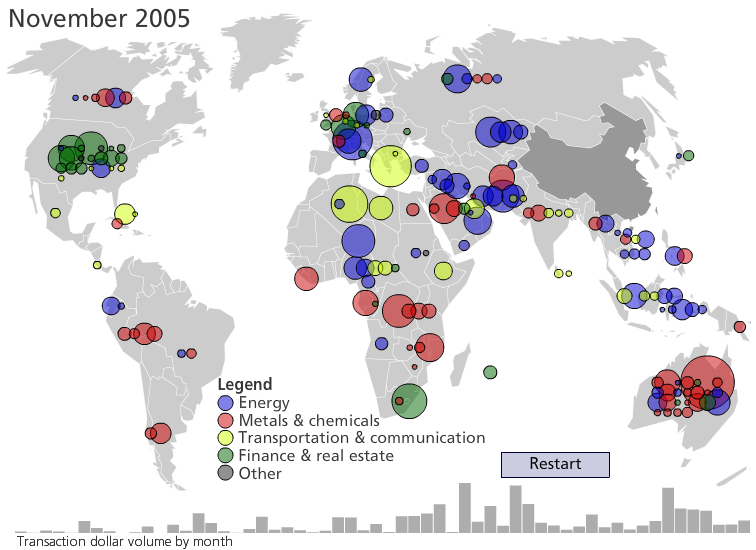
Forbes published my new map of Chinese overseas investments last night. It’s the first map I’ve made that involves animation, and it’s also the first map that I’ve built from scratch using nothing but ActionScript and Python. That turned out to be tricky in a neat, hackerish sort of way.
In the past, I’ve made all of my interactive maps using Avenza’s excellent MAPublisher software. MAPublisher handles geocoding and projections, which leaves me free to faff about with color schemes and callouts.
When you code your own map from scratch like this, though, you have to write something to geocode points and then project them (unless you’re partial to maps where Canada, Greenland and Russia seem to be taking over the world). There are less math-intensive solutions to this, like creating a map in Illustrator and then moving it to Flash (recommended for choropleth maps), but I wanted maximum programmatic control over the map (and the thrill of coding my own solution).
Geocoding was fairly easy in this case; I just derived centroids for each country using ArcGIS and merged those coordinates into the dataset from Heritage’s Derek Scissors using Stata. The data for each country now included deal value, acquirer, target, target’s country, latitude, and longitude.
Now for the projection: simply sizing down the latitude and longitude coordinates linearly by enough to make them represent pixel locations would result in a so-called ‘unprojected’ map that’s a dishonest representation of shapes and relative sizes. Unprojected maps also tend to waste a great deal of space by making the highest and lowest latitudes enormous and the middle latitudes small–a general problem for Web layouts like ours, where maps can’t be more than 768 pixels wide, and for this map specifically, because a great deal of Chinese investment has taken place in parts of Africa and South Asia that are near the equator.
I went for the Winkel Tripel projection, currently the presentation of choice for National Geographic and one that strikes a reasonable balance between angular and spatial distortion. Wikipedia conveniently provides the transformation formulae, which include functions like arccosines that I hadn’t seen since college physics classes. With longitude as λ, latitude as φ, and standard parallel–the latitude above and below the equator at which the projection is entirely accurate–as φ1, we get mappings for the x and y coordinates thus:
where
It would be easy to code these equations into ActionScript and have each user’s Flash player map the investment dots on the fly. But Flash files with more than 200 event listeners (counting rollover and click listeners on the dots and bar graph and click listeners on the legend and buttons) already strain some feebler computers. Preprocessing the mapping seemed like the way to go, so I did the projection transformation in Python as I built the XML files that underlie the map (one file that includes every investment, its magnitude for sizing, its x/y coordinates for location, and details for the callouts; and another file that includes monthly data for the bar graph).
With the XML files built in Python, ActionScript just had to handle some simple placement and sizing tasks: creating a circular movie clip for each investment, coloring it appropriately, and adding it as a child to the stage. The script adds all of the circles to the stage when the map loads, during the time that the background displays a big “Loading…” notice; as the animation plays, the circle movie clips are set to visible and a little popping animation is applied along with a small sound effect. While the Flash file is open in the viewer’s browser, the circles and spark bars are stored in arrays for easy access with the .indexOf() method.
The combination of sound effects and spark bars might seem redundant, but they illustrate two different dimensions of these investments: the spark bars show dollar volume, which might be high even in months when there’s just one investment. The monthly number of investments is the other dimension: the visual animation is meant to call the viewer’s attention to each newly-appearing circle, but it’s difficult to keep track of every new dot on the map every month. The sound effects reinforce the visual animation by giving an overall feel for the number of dots added each month (the popping sound plays once for every new investment in each month).